McFIT Homepage Optimization
Improving Usability and Accessibility Across Key Components
The McFIT homepage optimization is a multi-phase initiative focused on enhancing usability, accessibility, and overall user flow. So far, we've implemented a redesigned hero section, a new accessible button system, and a site-wide contrast audit to improve visual consistency across the brand's online presence.
Project Overview
McFIT's homepage is the most visited entry point across several country-specific websites. Over time, different modules and content were added without a clear structure, based mostly on internal requests. This led to a cluttered layout and an inconsistent user experience. The goal of this project was to improve key parts of the page to boost usability, accessibility, and ultimately conversion rates.
I focused on:
- Redesigning the Stage module to grab attention and guide users to the most important actions.
- Fixing accessibility issues, including contrast problems and unclear button styles, to align with WCAG 2.1 standards.
These updates help users navigate more smoothly, understand the content more clearly, and complete tasks with less effort. Because the site runs across multiple countries, every change had to be scalable and coordinated with legal, marketing, and development teams.
- {{row.label}}
- {{row.value}}
Research & Insights
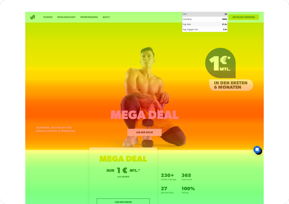
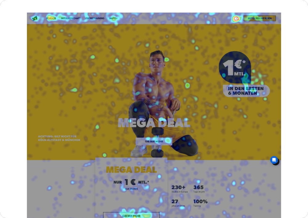
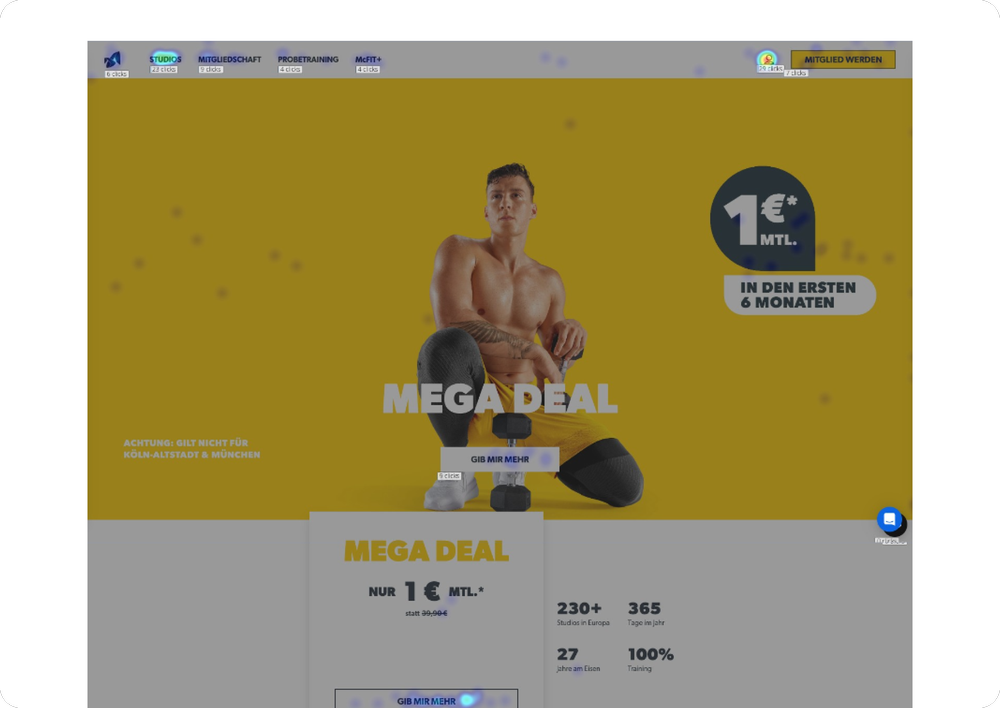
Before redesigning key areas of the McFIT homepage, I used Mouseflow to gather behavioral data and understand how users actually interact with the page. Heatmaps and scroll tracking revealed which sections received the most attention and where users dropped off. This data helped identify pain points, such as visual clutter and low engagement with key CTAs.
In addition to behavior analytics, I conducted an accessibility review based on WCAG 2.1 standards. This uncovered several issues, including poor contrast and unclear button hierarchies, which posed usability challenges for a broad range of users. Together, these insights informed a more focused and user-friendly redesign.
My Role
As Senior UX/UI Designer, I led homepage optimization and accessibility improvements for McFIT, focusing on usability, visual clarity, and conversion rates. I worked closely with digital, marketing, legal, KPM, and development teams to ensure solutions were both user-centered and technically feasible.
Key contributions:
- Translating research into design: Applied Mouseflow behavioral data and WCAG 2.1 findings to actionable homepage changes.
- Redesigning key components: Improved pricing cards, CTAs, and layouts for clarity and engagement.
- Enhancing accessibility: Fixed contrast issues, refined hierarchy, and improved spacing for inclusivity.
- Developer collaboration: Delivered detailed Figma documentation for accurate and responsive implementation.
A highly collaborative, cross-functional effort that delivered a more accessible, user-friendly, and conversion-focused homepage.
Design Process
Using Mouseflow heatmaps and scroll data alongside a WCAG 2.1 accessibility audit, I identified the key friction points that were hurting usability and accessibility. From there, the process unfolded in four clear steps:
- Analyzing the problem: Reviewing heatmaps, scroll data, and accessibility issues to identify friction points.
- Defining priorities: Selecting the components with the highest impact on usability and conversion.
- Designing solutions: Creating accessible, visually clear layouts in Figma, with detailed documentation for development.
- Implementing & validating: Collaborating with developers to ensure accurate implementation and conducting post-launch checks to confirm improvements.
Stage Module Redesign
The stage module (McFIT's hero area) was the first thing users saw. Heatmaps showed the primary CTA (“GIB MIR MEHR”) drew strong attention, but the decorative “1€” badge also attracted clicks, causing frustration since it wasn't interactive. Low text contrast and a busy layout further reduced clarity of the offer.
Goals:
- Reduce visual distractions and improve focus on the main CTA.
- Improve text readability and accessibility in line with WCAG 2.1 standards.
- Maintain the energy of McFIT's brand while creating a more structured layout.
Key Improvements:
- Clearer visual hierarchy: simplified layout with a stronger focal point on the main action.
- Contrast adjustments: ensured all text passed WCAG 2.1 contrast ratios for better readability.
- Accessible button design: updated primary CTA styles for better visibility and consistency across devices.
- Reduced misclicks: repositioned and restyled the “1€” badge to reduce confusion and highlight the actual CTA.
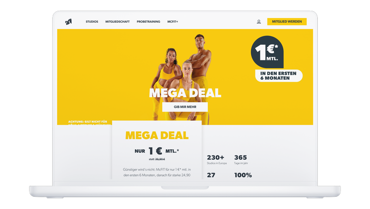
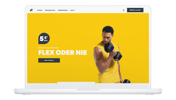
Before vs After
Measured with Mouseflow on the McFIT homepage, comparing the original stage module with the redesigned version after launch.
Results
- Reduced misclicks by removing the “1€” badge as a clickable-looking element.
- Increased CTA focus through a simplified layout and stronger visual hierarchy.
- Improved readability with text contrast adjustments meeting WCAG 2.1 standards.
- Consistent accessibility with updated, clearly defined button styles across devices.
After addressing these issues, the redesigned hero section improved clarity, reduced distraction, and made the main CTA stand out as the single, obvious action.
Additional Accessibility & UI Enhancements
While the Stage Module redesign was the primary focus, several high-impact accessibility and UI consistency issues across the McFIT website were addressed to ensure a fully inclusive and visually cohesive experience.
1. Button Styling System
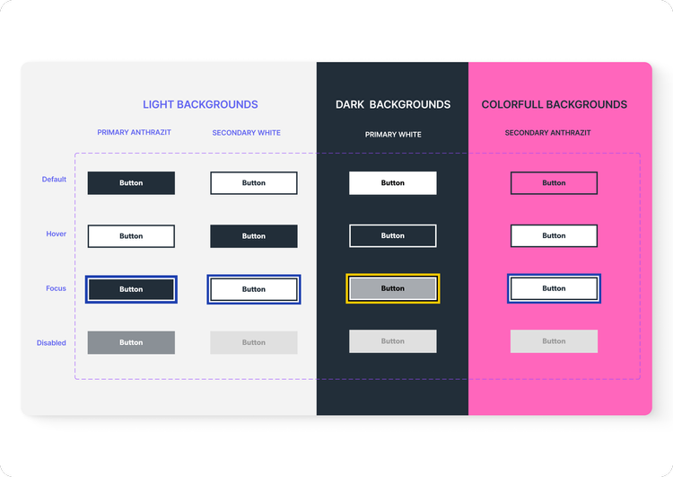
To address accessibility gaps and maintain brand consistency across McFIT's marketing campaigns, I designed a scalable, WCAG 2.1–compliant button set optimized for light, dark, and vibrant campaign backgrounds.
Before this update, buttons had no focus state, which caused accessibility issues for keyboard and screen reader users. The new set introduced default, hover, focus, and disabled states, ensuring clear interaction feedback for all users.
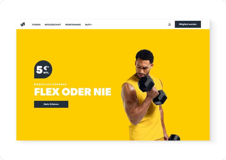
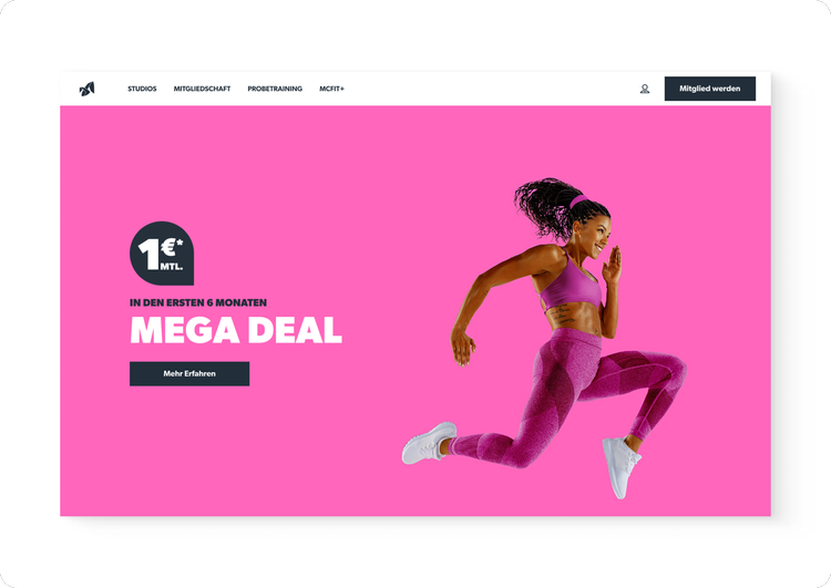
This system was then rolled out across seasonal marketing campaigns (e.g., Mega Deal, Flex Deal, Cyber Deal), ensuring every promotional page had consistent, accessible calls-to-action regardless of the background color or layout.

Impact
- Ensured buttons passed WCAG 2.1 contrast ratios.
- Reduced missed clicks and improved CTA clarity.
- Provided a reusable component library for future campaigns, reducing design and development time.
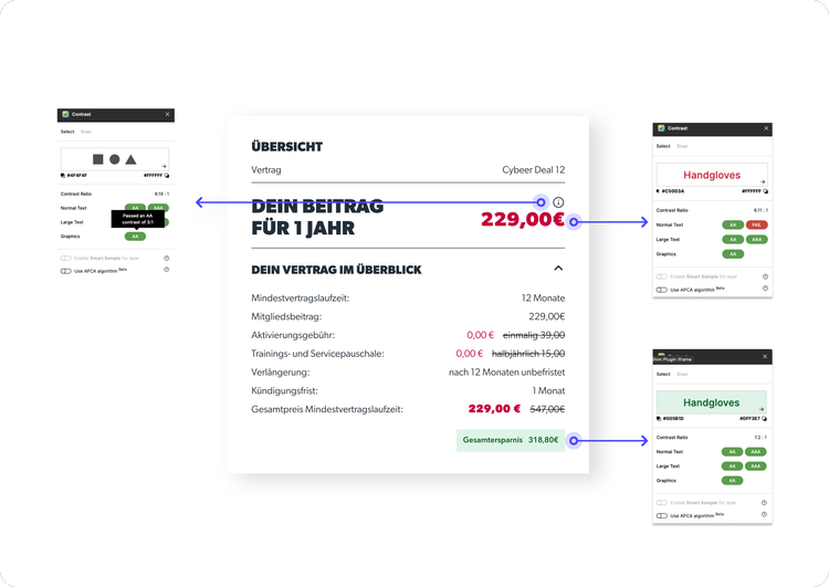
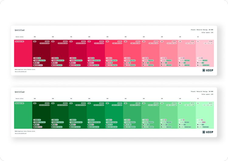
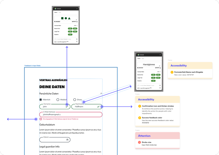
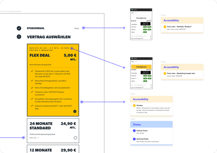
2. Key Accessibility Fixes Across Components
To improve usability and meet WCAG 2.1 guidelines, I implemented updates across multiple components:
- Text links: Increased contrast for better readability.
- Marketing banners: Adjusted typography and background colors to improve legibility.
- Tooltips & Feedback: Standardized colors for tooltips, error, and success messages.
- Form inputs: Improved label visibility and focus states for better accessibility.
- Selected states: Added clear visual indicators for selected contracts and gym locations.
Outcome
The McFIT homepage optimization not only improved usability and accessibility but also delivered measurable business impact.
Key results:
- +85% increase in scroll depth to the primary CTA, ensuring more users reached the main conversion point.
- +128% lift in CTA click rate after clarifying the layout and removing distractions.
- +76% improvement in mobile engagement time, showing higher user interaction and retention.
- −87% reduction in misclicks on non-interactive elements (e.g., the “1€” badge).
- WCAG 2.1 AA compliance achieved for color contrast and focus states across multiple homepage components.
These improvements were scalable and rolled out to other country websites, ensuring a consistent, accessible, and conversion-focused experience across McFIT's digital presence.
Future Improvements
The homepage redesign has already delivered measurable gains in clarity, accessibility, and engagement, but there are still opportunities to build on these results:
- Pricing card redesign: A streamlined, more accessible layout is in progress to make plan comparisons easier and reduce decision friction.
- Personalized hero content: Explore dynamically adapting the hero section based on user location or membership status to increase relevance.
- Refined analytics tracking: Implement more detailed CTA tracking to capture micro-interactions and inform ongoing optimization.
These next steps aim to continue enhancing the user experience, driving higher conversions, and ensuring the homepage remains both engaging and accessible for all users.
Reflection & Learnings
This project reinforced the importance of basing design decisions on real user behavior rather than assumptions. Using heatmap analytics alongside a WCAG 2.1 accessibility audit provided an objective foundation for identifying and prioritizing improvements. It was also a reminder of how essential it is to balance brand expression with usability, preserving McFIT's bold, energetic style while ensuring the interface is inclusive and accessible required both creativity and precision.
Working across multiple departments, countries, and legal frameworks emphasized the need for clear communication and thorough documentation. Coordinating with teams in marketing, legal, development, and KPM made it clear that successful, scalable improvements rely on a shared understanding of goals, constraints, and execution plans, especially when updates must be rolled out to multiple international websites.
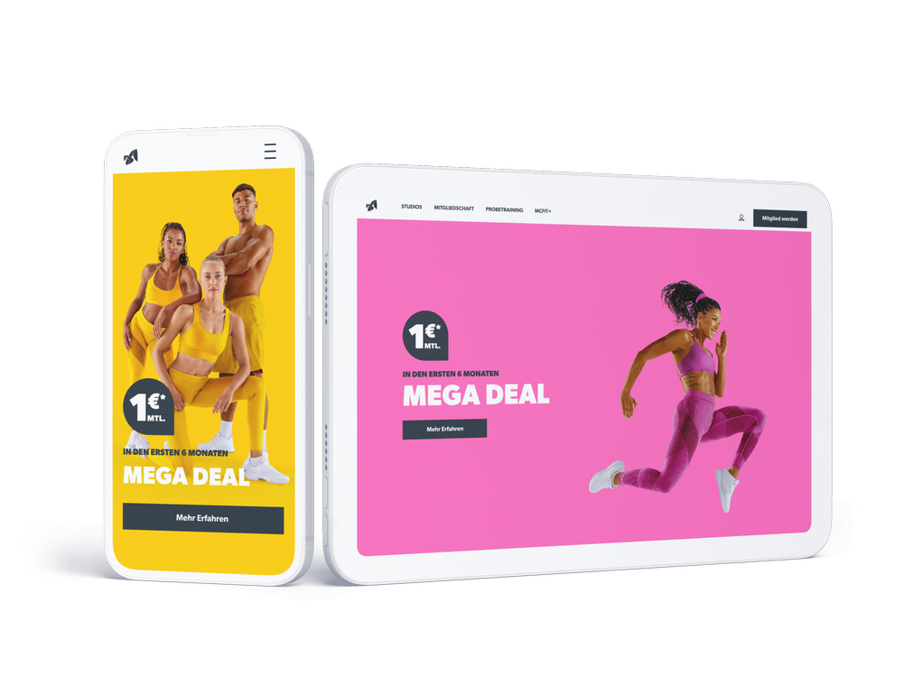
A cleaner, more accessible homepage that drives focus to what matters most, helping McFIT connect with users across all country websites.