McFIT-APP
Designing in the real world means working with constraints and still finding ways to make an impact.
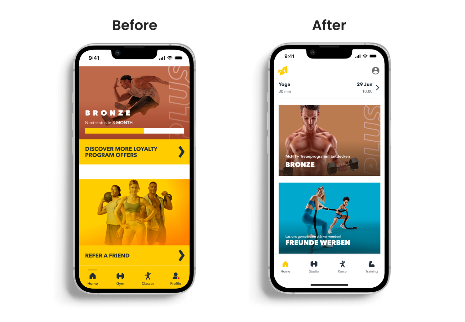
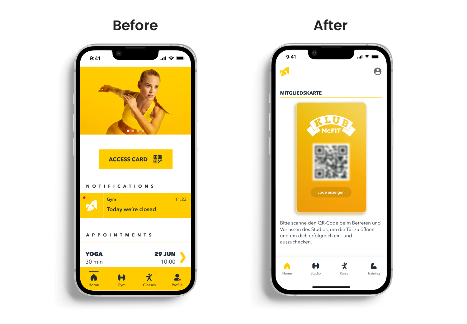
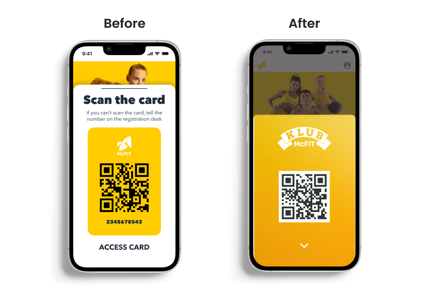
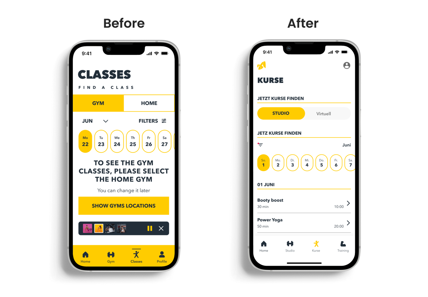
During the McFIT app redesign, I focused on improving the training section experience and updating the visual UI across core screens. Working within technical and organizational limitations, I delivered solutions that balanced business needs with user expectations and learned a lot about what it takes to push good design forward in complex environments.
Project Overview
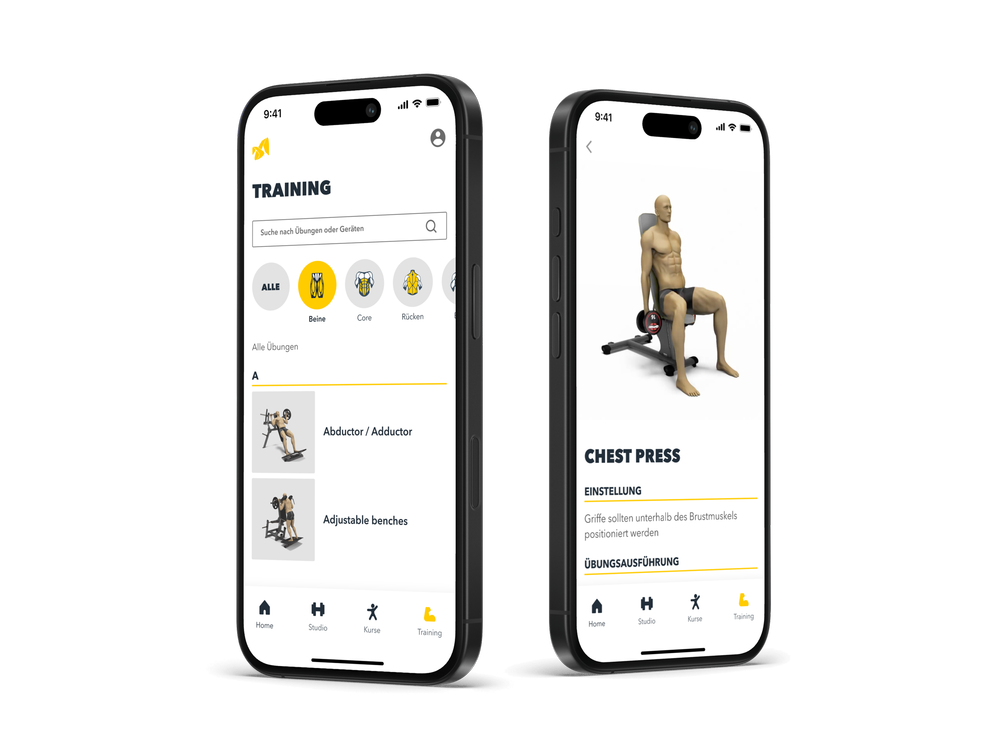
McFIT is one of Europe's largest fitness studio chains, but their mobile app needed a refresh. As part of the UX/UI team, I was brought in to help redesign key areas of the app, particularly the training experience and bring consistency to the interface.
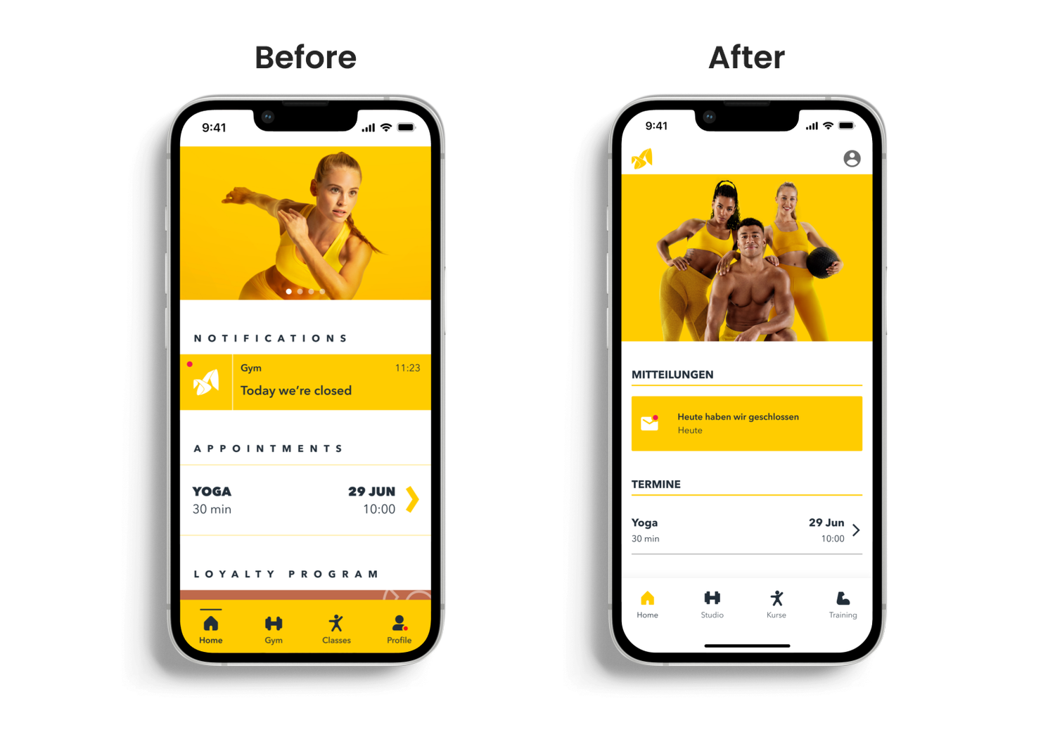
My focus was on improving the training library, refreshing the overall UI for mobile, and contributing to the design system. The project involved close collaboration with developers and other design teams, working within business and technical constraints that impacted how much of the vision could be implemented. Despite those limitations, I helped create a bolder, more functional experience that better aligns with McFIT's brand and user needs.
- {{row.label}}
- {{row.value}}
Research & Insights
At the time of the redesign, the app didn't include a training library or structured workout guidance. Based on user needs, internal goals, and future potential, we identified key opportunities:
- {{it.title}} {{it.desc}}
These insights helped shape the direction of the redesign, balancing new feature ideas with foundational UX improvements.
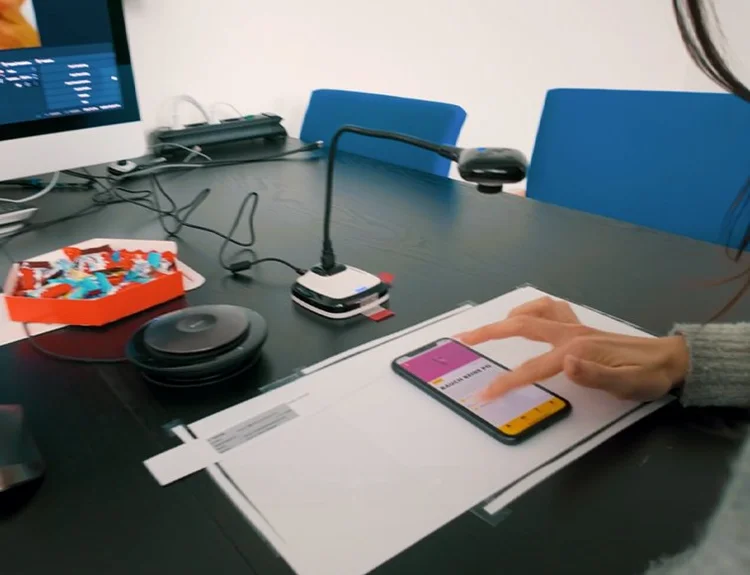
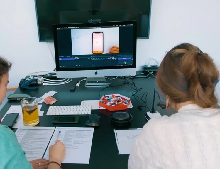
User testing session conducted by an external research team to evaluate the existing app experience.
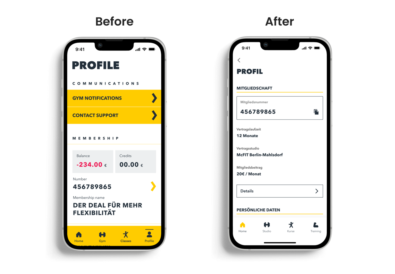
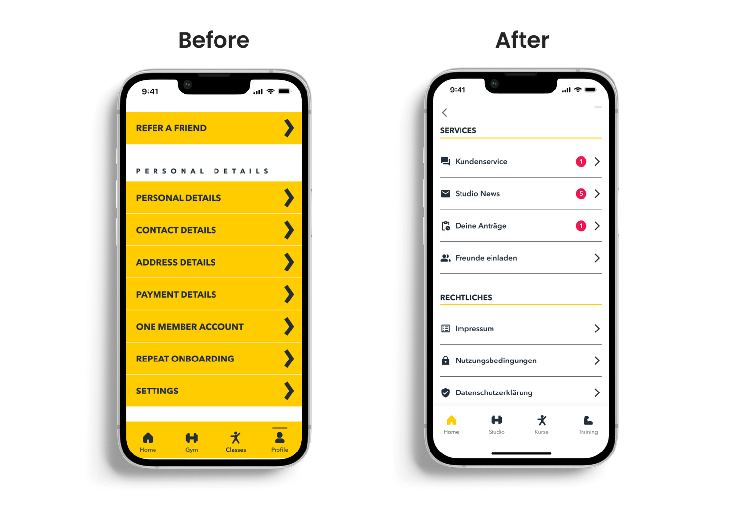
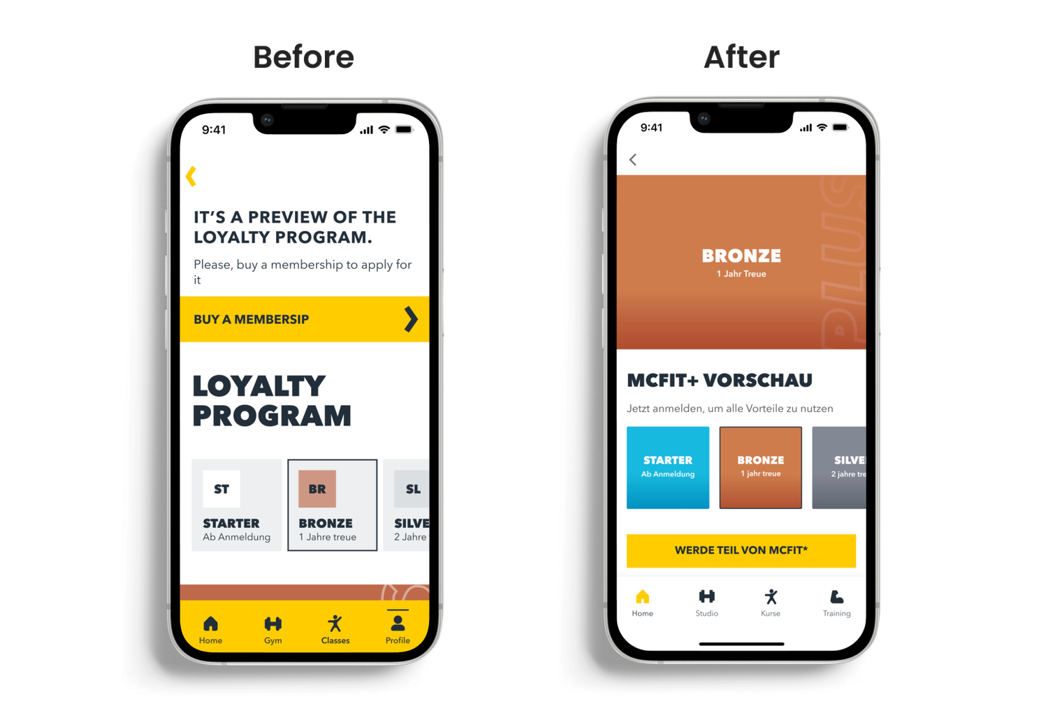
Although I wasn't involved in the testing directly, the insights helped us identify UI pain points and informed decisions to improve consistency and align the design more closely with the McFIT brand.
My Role
As the sole UX/UI designer on the McFIT app redesign, I was responsible for leading the design of the new training experience and modernizing the app's overall interface. I collaborated closely with developers, PMs, and the marketing team throughout the process.
My focus areas included:
- {{it.title}} {{it.desc}}
This was a cross-functional effort with many constraints and compromises, but also an opportunity to bring real user and brand value into the product.
Design Process
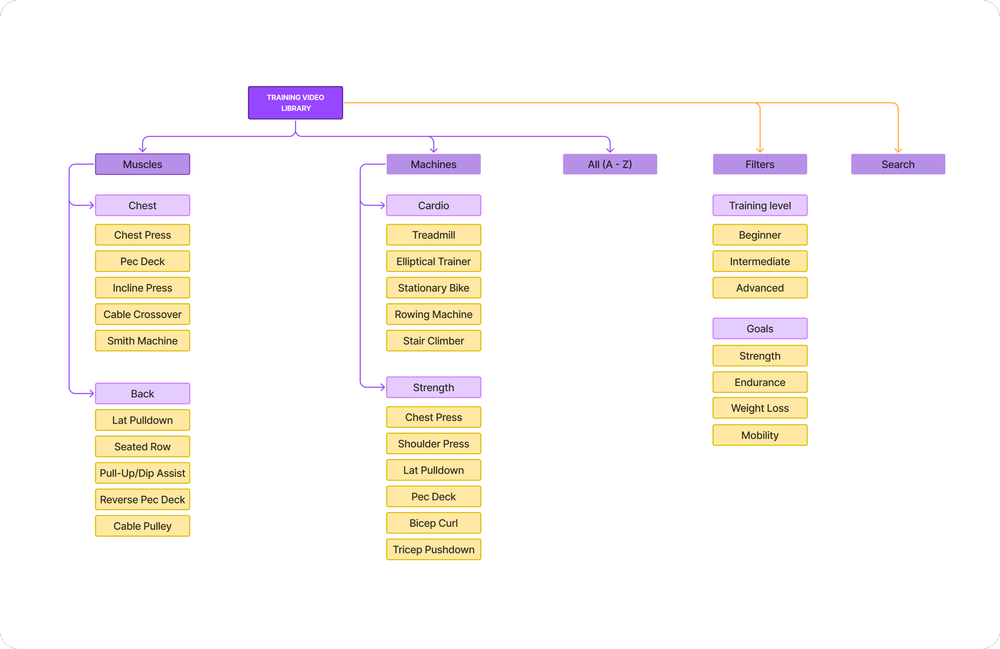
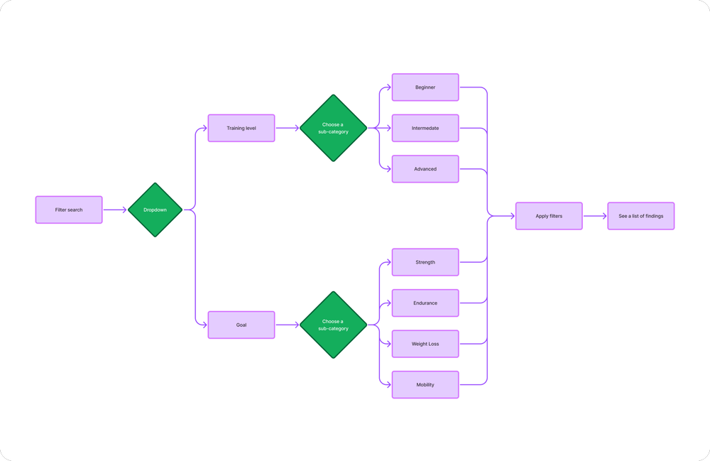
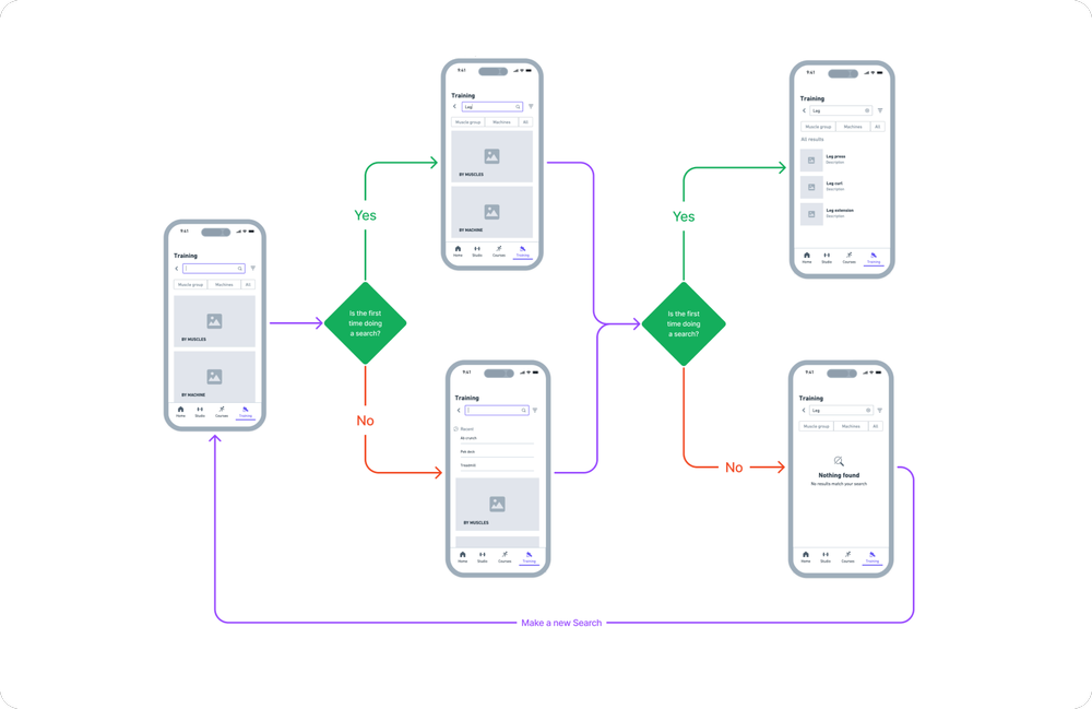
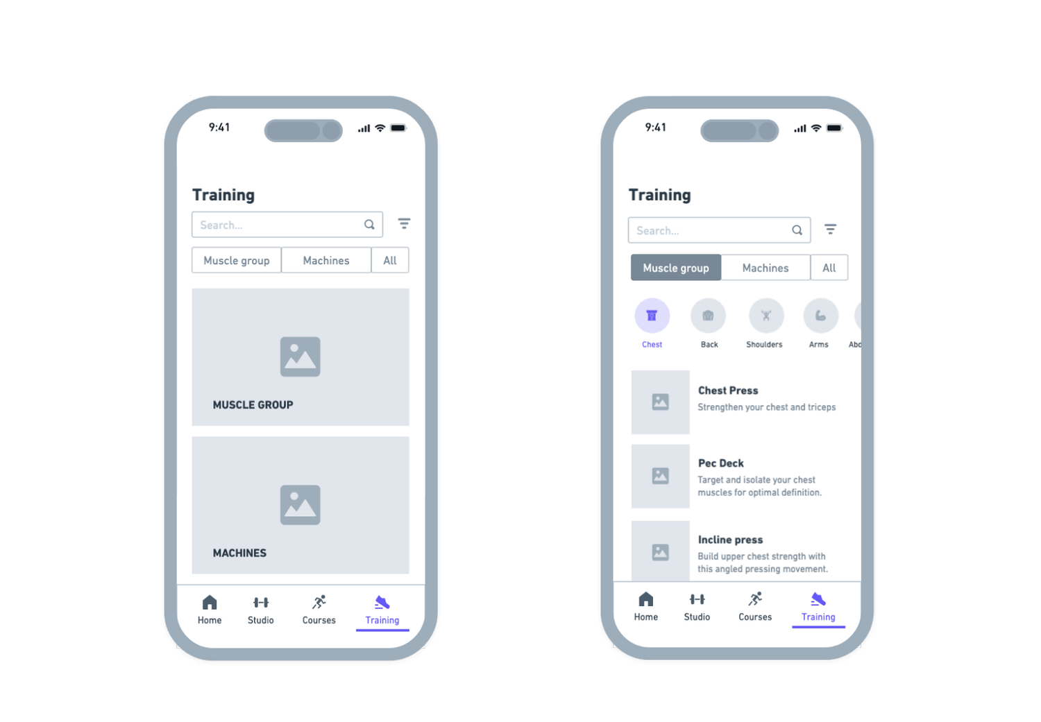
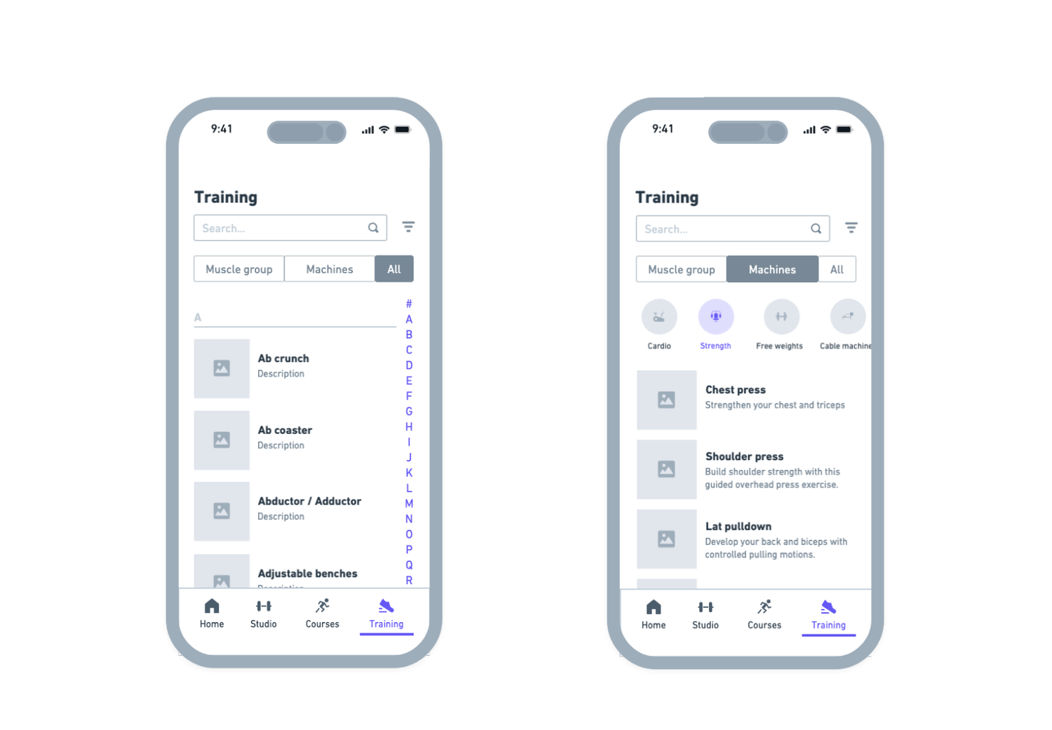
Since the app didn't yet include a training section, I was responsible for designing this experience from the ground up, from structure and flow to interface and UI components.
Here's how I approached it:
- {{it.title}} {{it.desc}}
Throughout the process, I worked closely with developers, PMs, and stakeholders to align design decisions with technical feasibility and business needs.
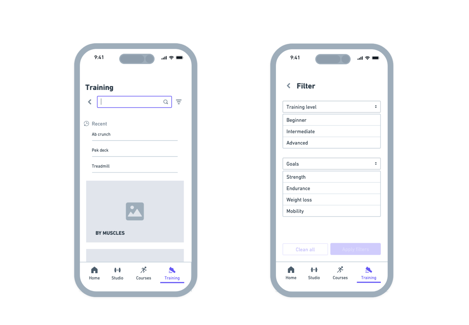
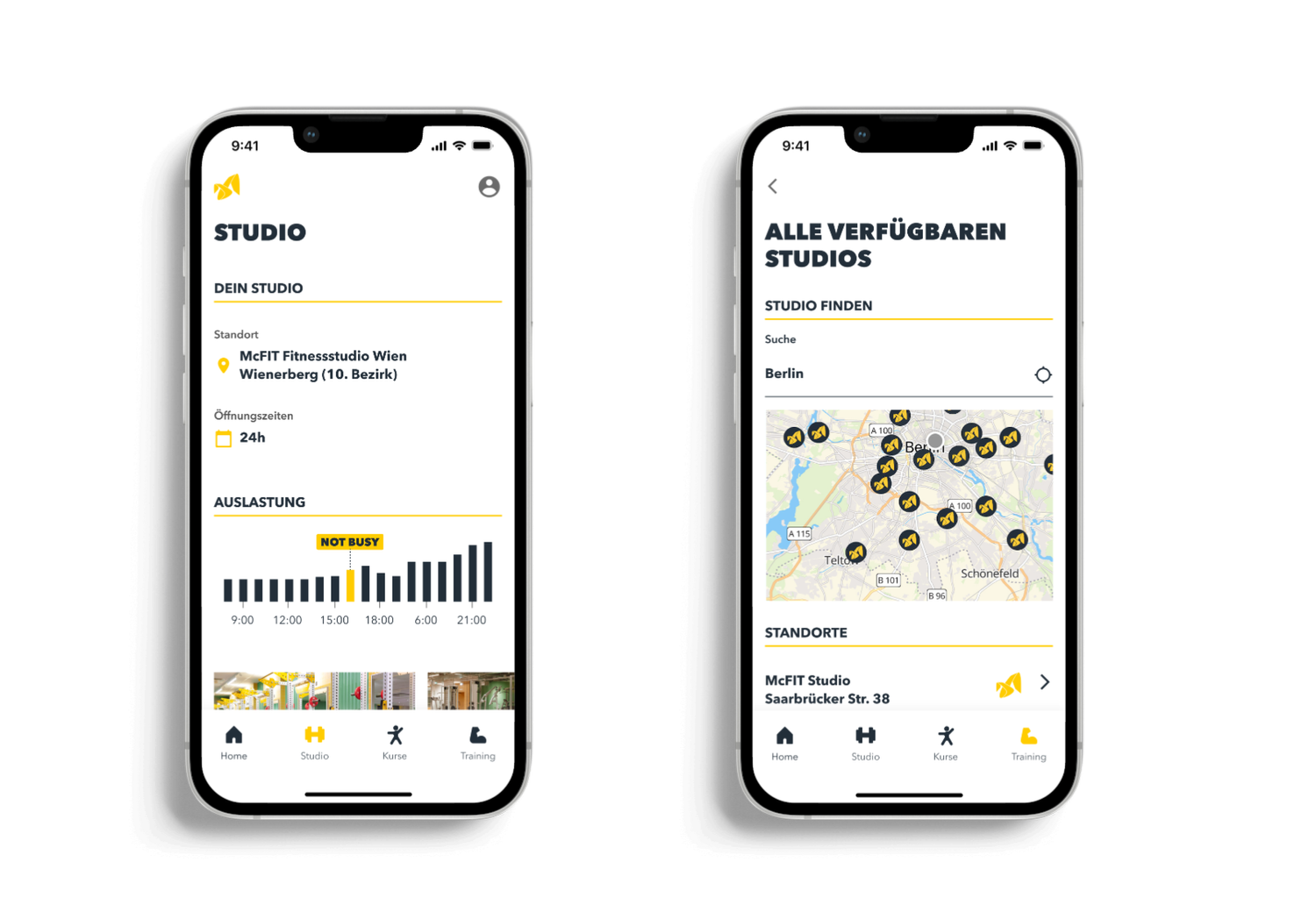
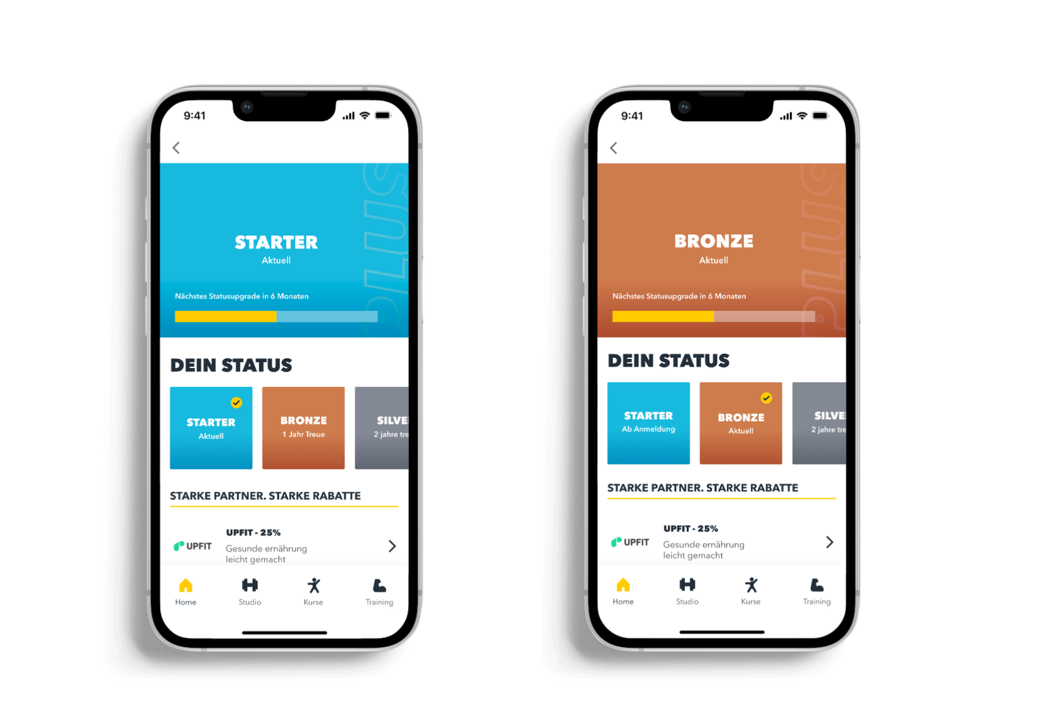
UI Design & Final Screens
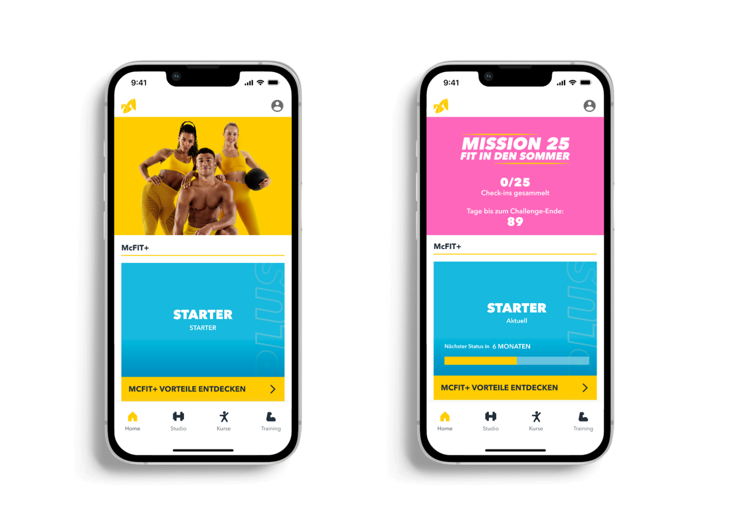
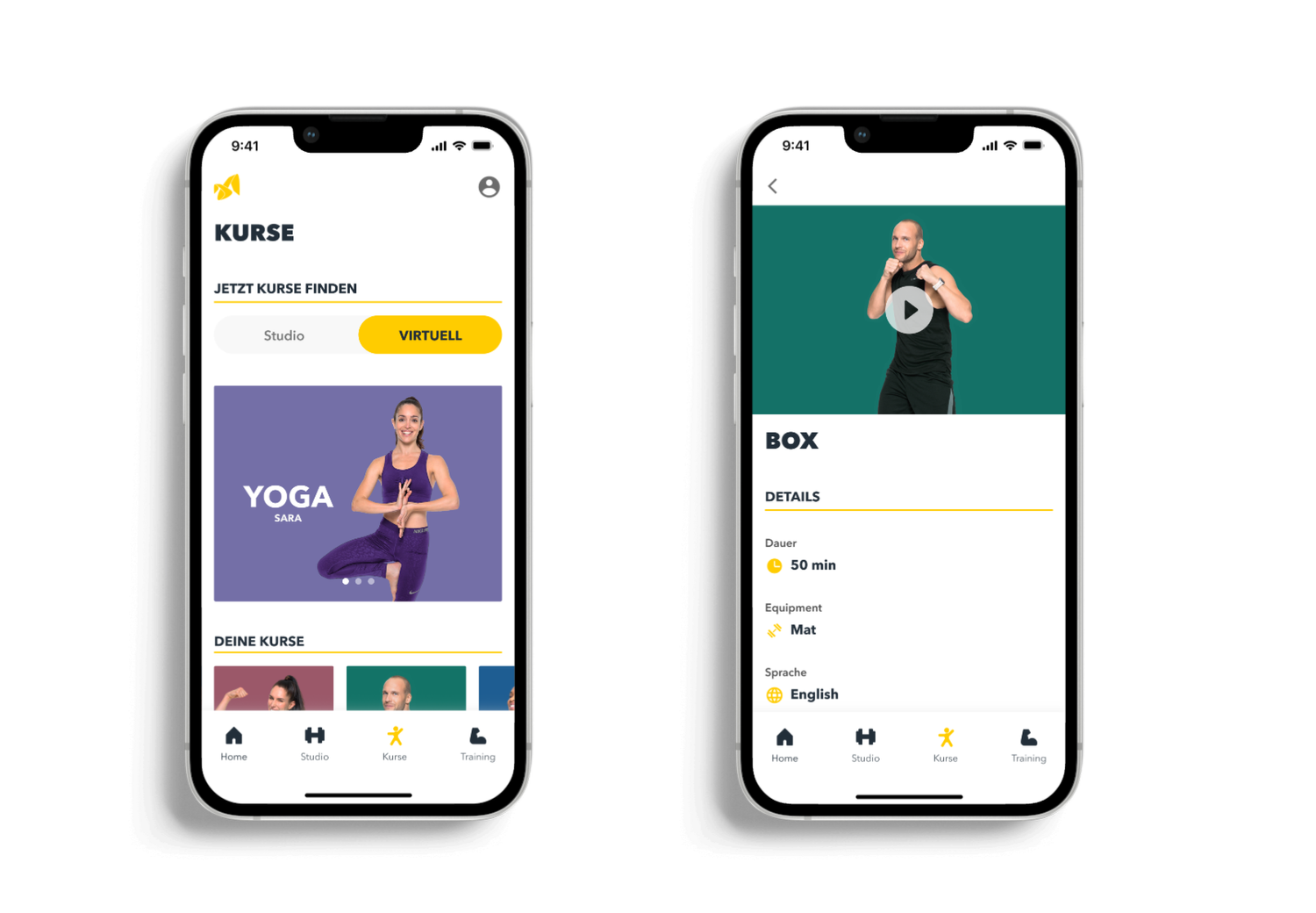
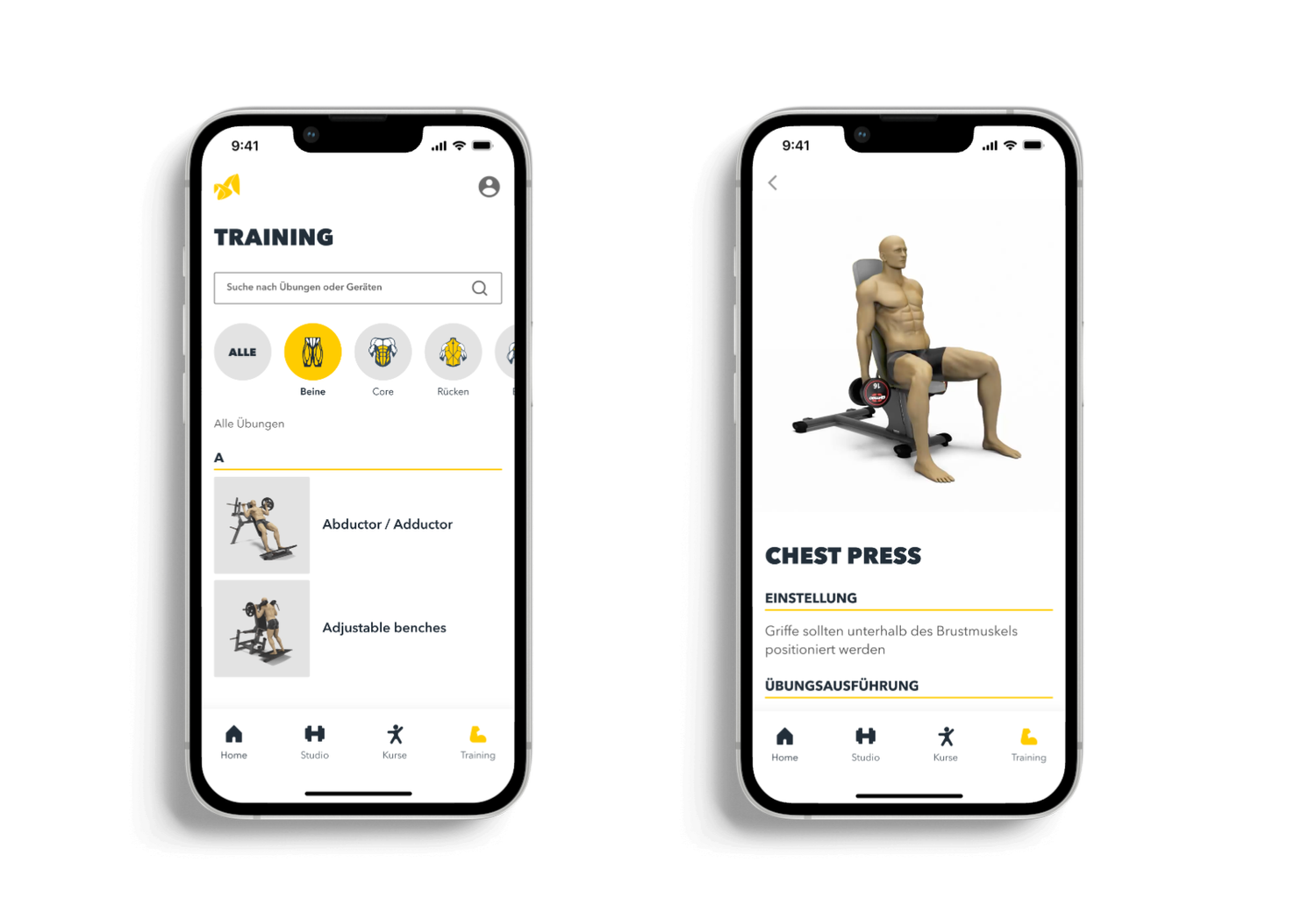
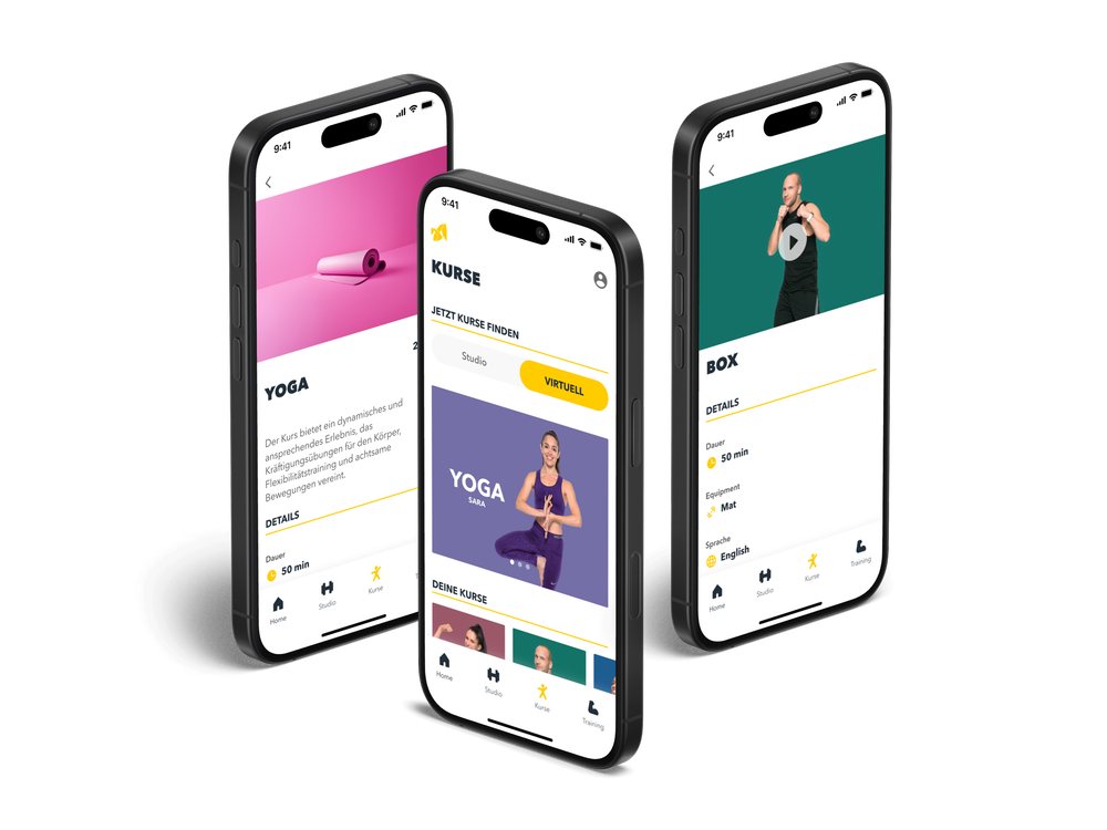
Once the structure and flow were defined, I moved into high-fidelity design applying McFIT's bold visual style, working within the updated brand palette, and refining components for clarity and usability.
I focused on visual hierarchy, contrast, and mobile accessibility, adapting the designs to feel dynamic, motivating, and easy to navigate, even in high-movement, in-gym situations.

Design System & UI Foundations
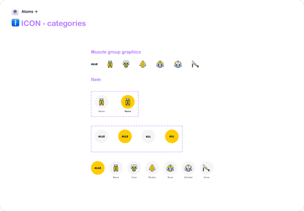
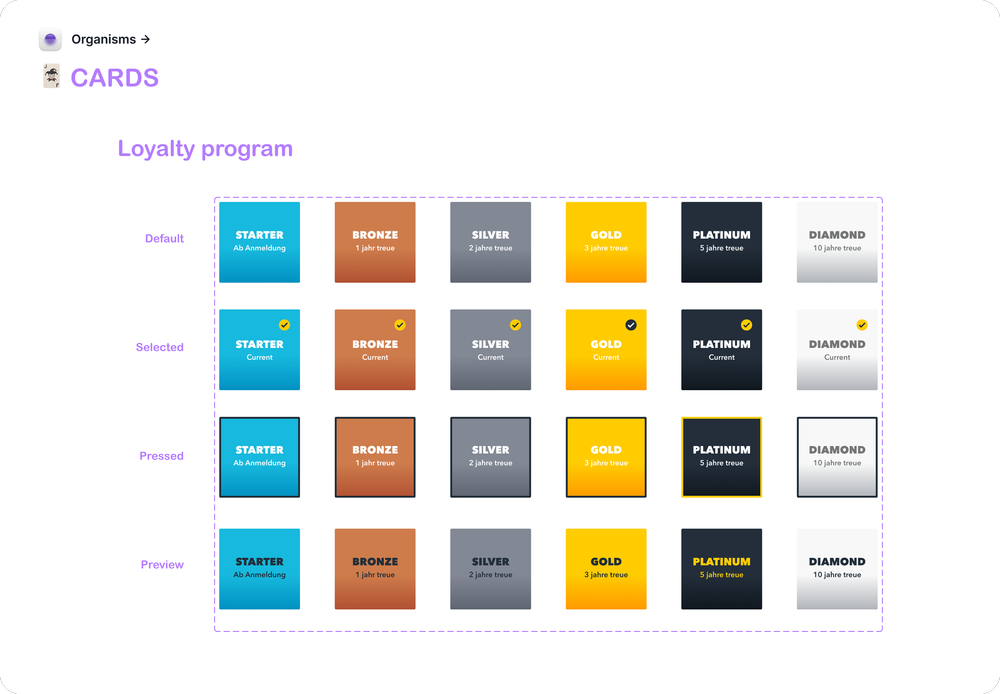
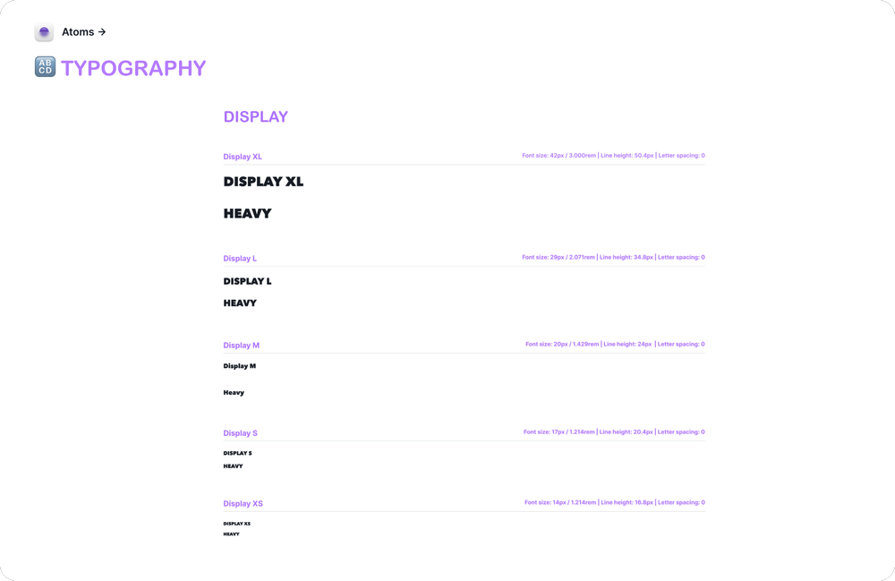
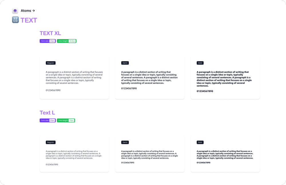
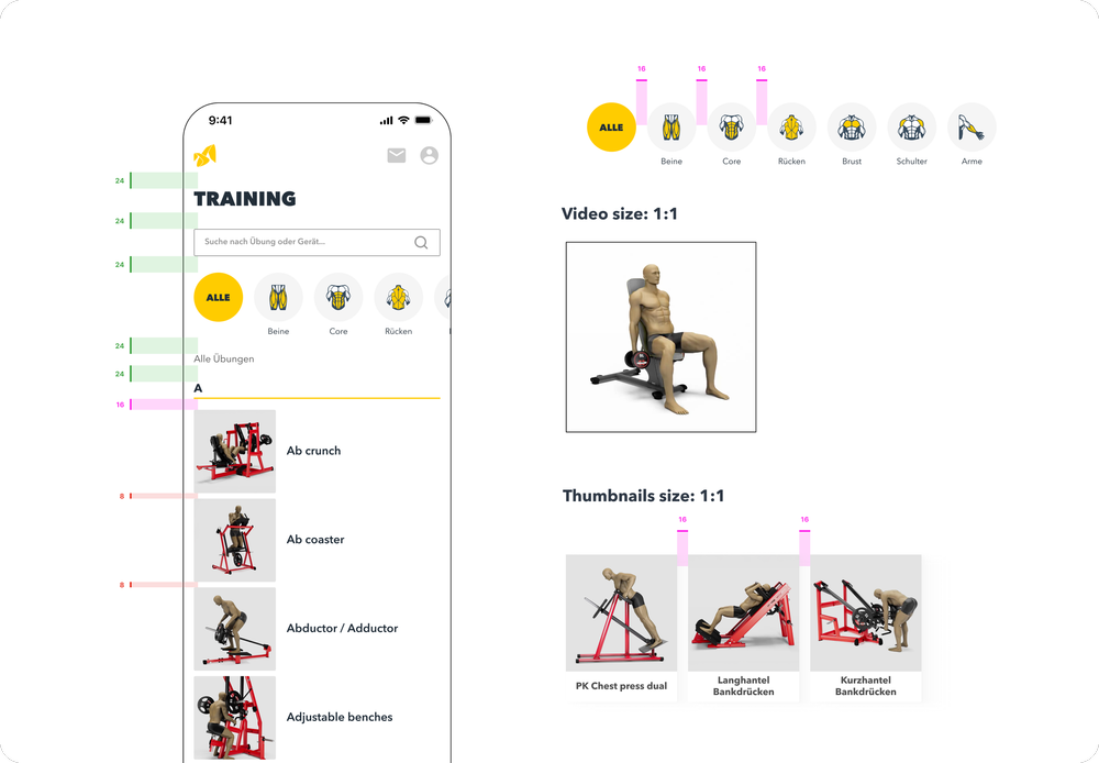
In parallel with the screen designs, I created the foundation of a scalable design system for the McFIT app.
I followed the Atomic Design methodology to build consistent and reusable components, starting from simple elements like buttons and form fields, and scaling up to modules, layouts, and full-page patterns.
This system included:
- Buttons systems
- Interactive components
- Typography, text arrangements, color, and spacing tokens
- Accessibility guidelines and mobile responsiveness
- Among other foundational elements to support long-term scalability and consistency
Reflection & Learnings
Working on the McFIT app challenged me in all the right ways. As the only designer, I had to make strategic decisions, solve visual and technical problems, and build a scalable system while collaborating across departments.
Not every feature is live yet, the AI-powered training plan, for example, is still in development and some parts of the UI evolved after handoff. But that's part of the process. This experience helped me become more adaptable, more focused on long-term consistency, and more confident in advocating for design.
The McFIT app continues to evolve, and I'm proud to have helped lay the foundation for a more user-friendly and brand-aligned product.