John Reed USA Website
Balancing artistic vision and user experience in a high-profile brand website.
John Reed is a brand that breaks the mold of traditional fitness spaces. For the launch of its USA website, I was tasked with bringing a strong creative vision to life online. My role was to transform artistic ideas and unconventional layouts into a functional website, collaborating with cross-continental teams and balancing visual impact with user needs.
Project Overview
John Reed is a bold and unconventional fitness and lifestyle brand known for its artistic spirit and unique club environments. For the USA market launch, I designed the full website, translating a strong creative vision into a functional digital product.
This project required balancing artistic direction, driven by leadership in Germany, with the practical needs of a US market audience. I collaborated closely with the US team (PMs, developers, and copywriters) while interpreting visual ideas and rough drafts into a working website.
Although the final product reflects a highly creative approach, I worked to structure the website for clarity and usability where possible, while respecting the creative vision. I contributed UX recommendations and organized the content to support key user goals such as exploring clubs, learning about services, and joining online.
- {{row.label}}
- {{row.value}}
My Role
I was the sole designer responsible for bringing the John Reed US website to life. Working closely with the Head of Brand in Germany who defined the creative direction and a US-based team of developers, project managers, and copywriters, I translated early design sketches and brand ideas into a fully responsive website.
My contributions included adapting and expanding the visual style, designing all desktop and mobile screens in Figma, and collaborating with developers during handoff and implementation.
Translating Brand Vision into Digital Experience
The final site strongly reflects the brand’s bold, artistic identity shaped by creative direction and early visual sketches provided by the Head of Brand. My role was to translate these ideas into a responsive website, expanding upon the initial InDesign layout to develop cohesive pages and interactive components.
While some design choices, such as expressive typography or low-contrast elements leaned more into visual storytelling than UX best practices, I offered accessibility-focused recommendations throughout the process. Certain suggestions couldn’t be implemented due to creative priorities, but I worked to maintain clarity, structure, and navigability wherever possible.
This project challenged me to adapt within a non-traditional design process, advocate for users, and find a balance between artistic expression and digital functionality, especially when collaborating across different disciplines and countries.
Design Process
My role in this project focused on expanding the initial homepage concept into a fully responsive website. Working in Figma, I designed all desktop and mobile layouts based on the creative vision set by the Head of Brand.
Although the process didn’t follow a traditional UX flow, I approached the work with structure, building out sections, establishing hierarchy, and ensuring consistency across pages. I created bold visuals that aligned with the brand’s personality, while working to keep navigation clear and the layout functional.
All final designs and assets were prepared in Figma and handed off to the development team in the US with notes, components, and responsive specifications.
Final Designs
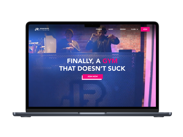
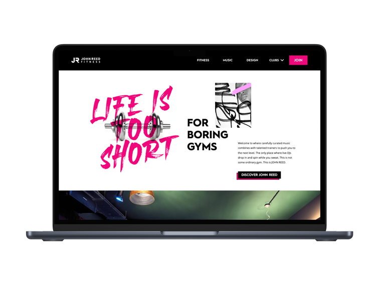
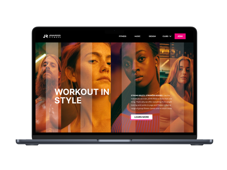
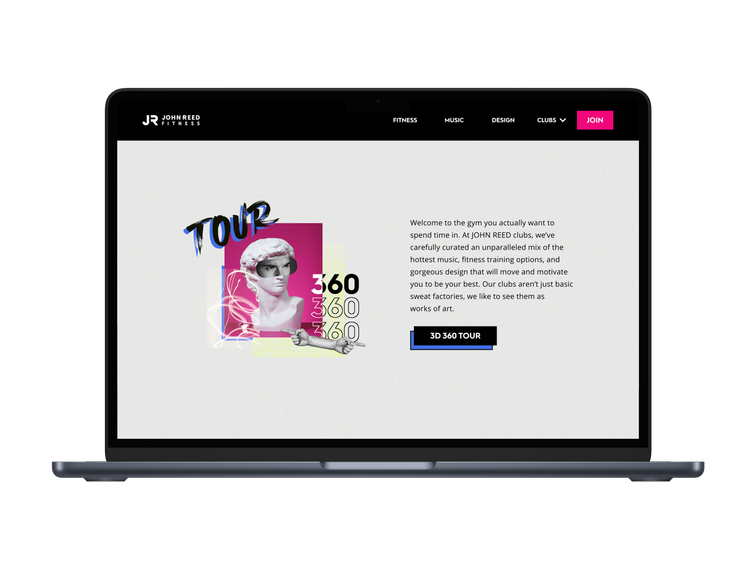
These are selected screens from the John Reed US website, designed to bring the brand’s expressive personality into a functional digital experience.
While the visual direction was predefined, I shaped each page to feel consistent, navigable, and responsive across devices. From layout structure to mobile adaptations, I focused on making the site feel dynamic and clear while staying true to the bold aesthetic.
Reflection & Learnings
Designing the John Reed US website was a unique challenge. I had to translate an artistic vision into a working product, balancing bold aesthetics with structure, usability, and responsiveness often within tight creative constraints.
Although the direction came from leadership, I found opportunities to bring clarity and cohesion into the final design. It reinforced the importance of adapting, listening, and advocating for user needs even in visually expressive environments.
The John Reed website pushed me to grow as a designer navigating strong creative direction, cultural nuance, and remote collaboration to deliver a bold, functional brand experience.